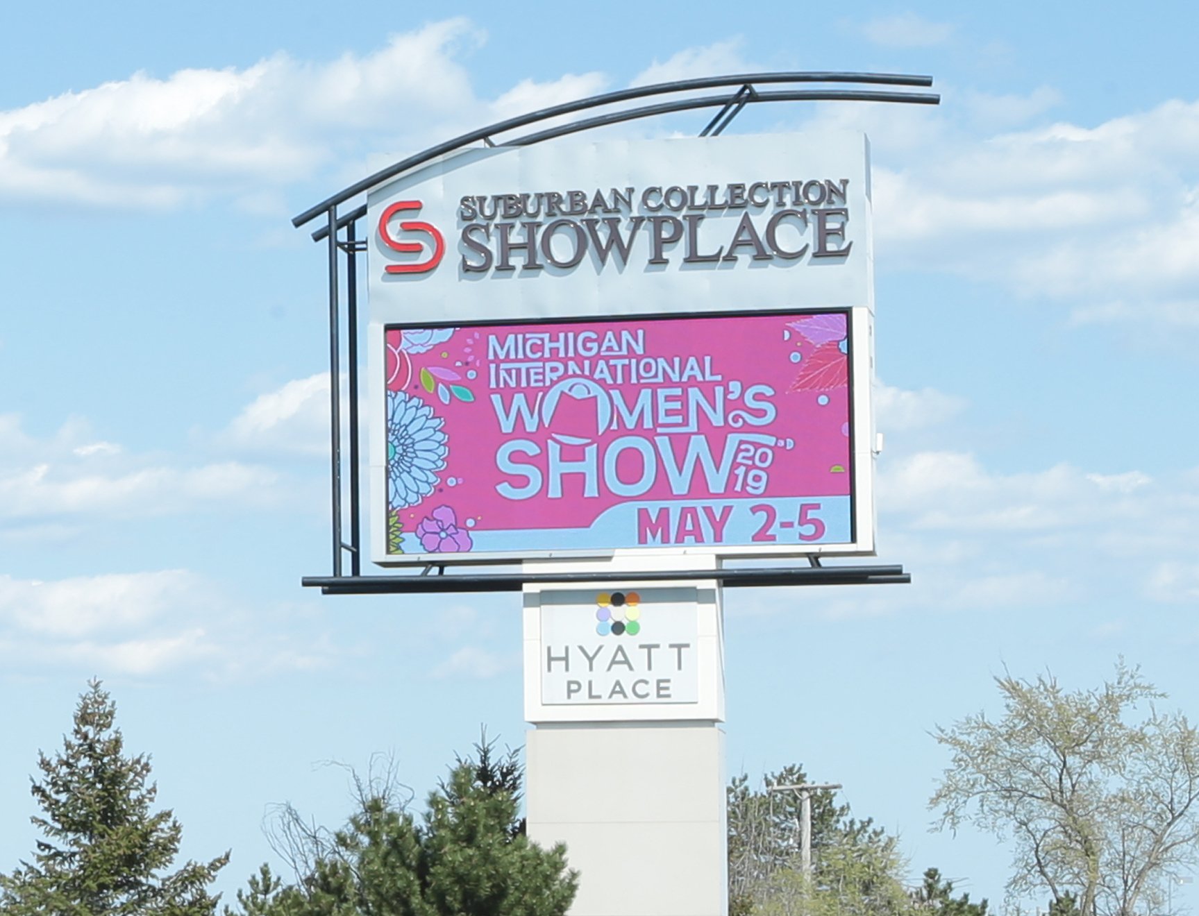
 Electronic signs vary a great deal and there are many noticeable and visually appealing options to choose from. Whether you are upgrading to a new LED sign, or simply updating the content on your current one, it is imperative to consider the location of your LED to determine the best type of content including text size, fonts, colors, etc. that will be the most beneficial to your application.
Basic Content for LED Displays
Here are the types of content you can program onto your LED display:
- Text message
- Text message with a background image or picture
- Image (by itself)
- Graphic
- Videos and live feed
- RSS feed (stock/weather/sports ticker)
- Time and temperature readings
- Media player
Businesses that design an outdoor LED sign that is visually attractive can boost revenue anywhere from 15-150% in the first year.
Choosing the Correct Size and Placement of your LED Sign
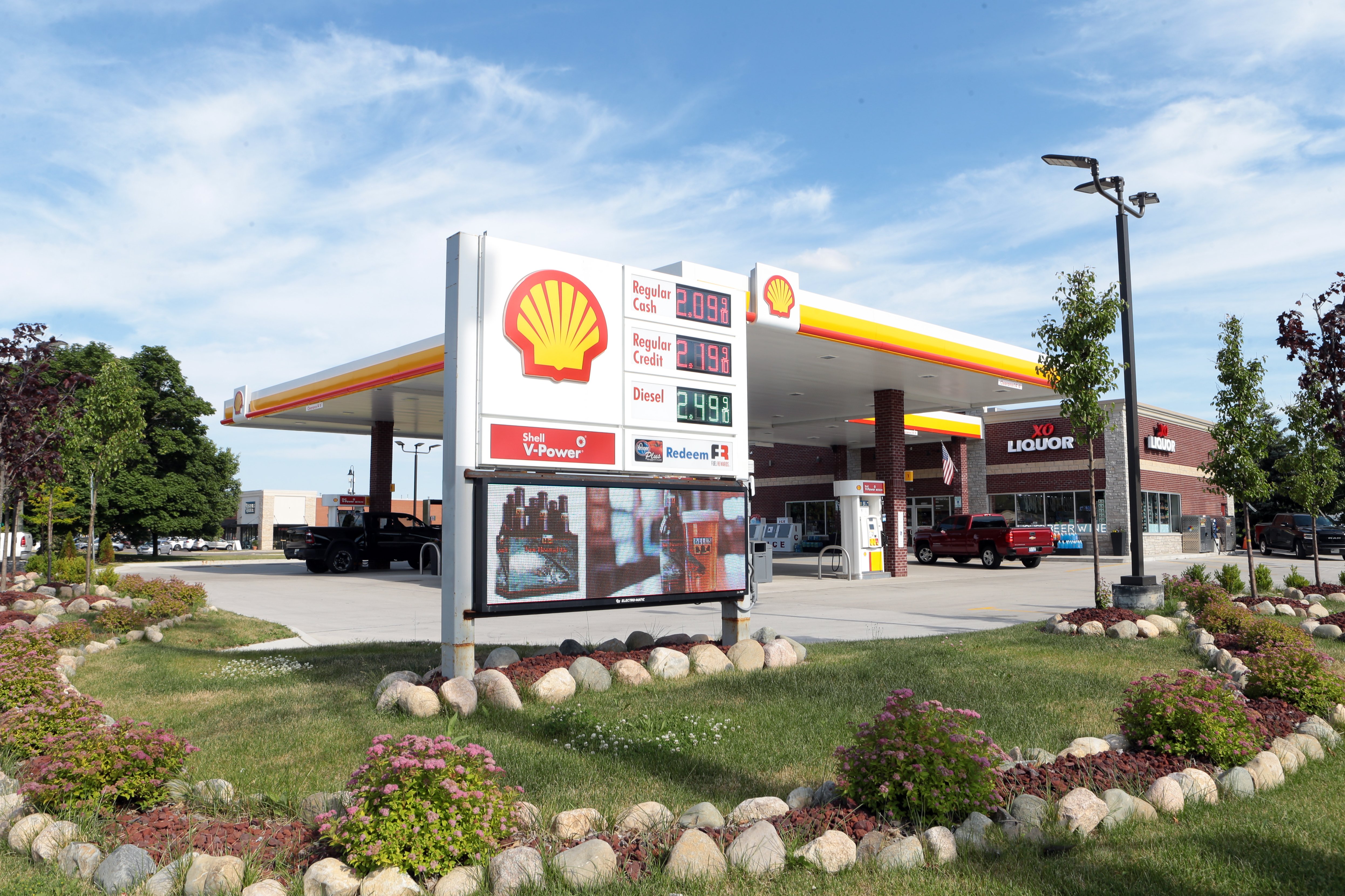 Before settling on the location of your sign as well as the physical size and pixel pitch, you have to think about where your most desired audience will be when they view it. All of these decisions will be predicated on the amount of visibility and exposure time your custom sign will have from the viewer. This relates to the speed of traffic passing by and any obstructions along the travel route. You will also get a better idea of the competing distractions such as other signs, traffic flow and congestion, road conditions, etc. These factors will impact how noticeable the sign will be once you get it in place.
Generally, 10 times the sign's square footage is the maximum distance your audience can be reached. Any person who is beyond that calculated distance will have a harder time making out the content, which decreases the impact your sign has.
If square footage is limited, a tight pixel pitch on a high-resolution LED sign will help you to exhibit more detailed graphics and crisper content on your sign. If the EMC is viewed at a distance closer than the "Minimum", messages will still be readable but will appear pixelated.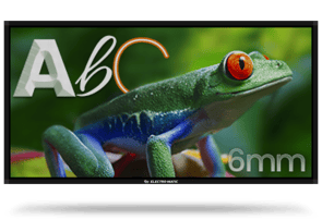
Pixel Pitch: 6mm
Pixel Type: SMD![]() Tile Matrix: 60 x 60
Tile Matrix: 60 x 60
Video Framerate (FPS): 60
NITs: 10,000
Ideal Viewing Distance: 21 ft
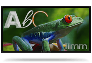
Pixel Pitch: 11mm
Pixel Type: DIP
Tile Matrix: 36 x 36
Video Framerate (FPS): 60
NITs: 10,000
Ideal Viewing Distance: 36 ft
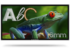 Pixel Pitch: 16mm
Pixel Type: DIP
Tile Matrix: 24 x 24
Video Framerate (FPS): 60
NITs: 10,000
Ideal Viewing Distance: 54 ft.
Creating Content for Optimal Visibility
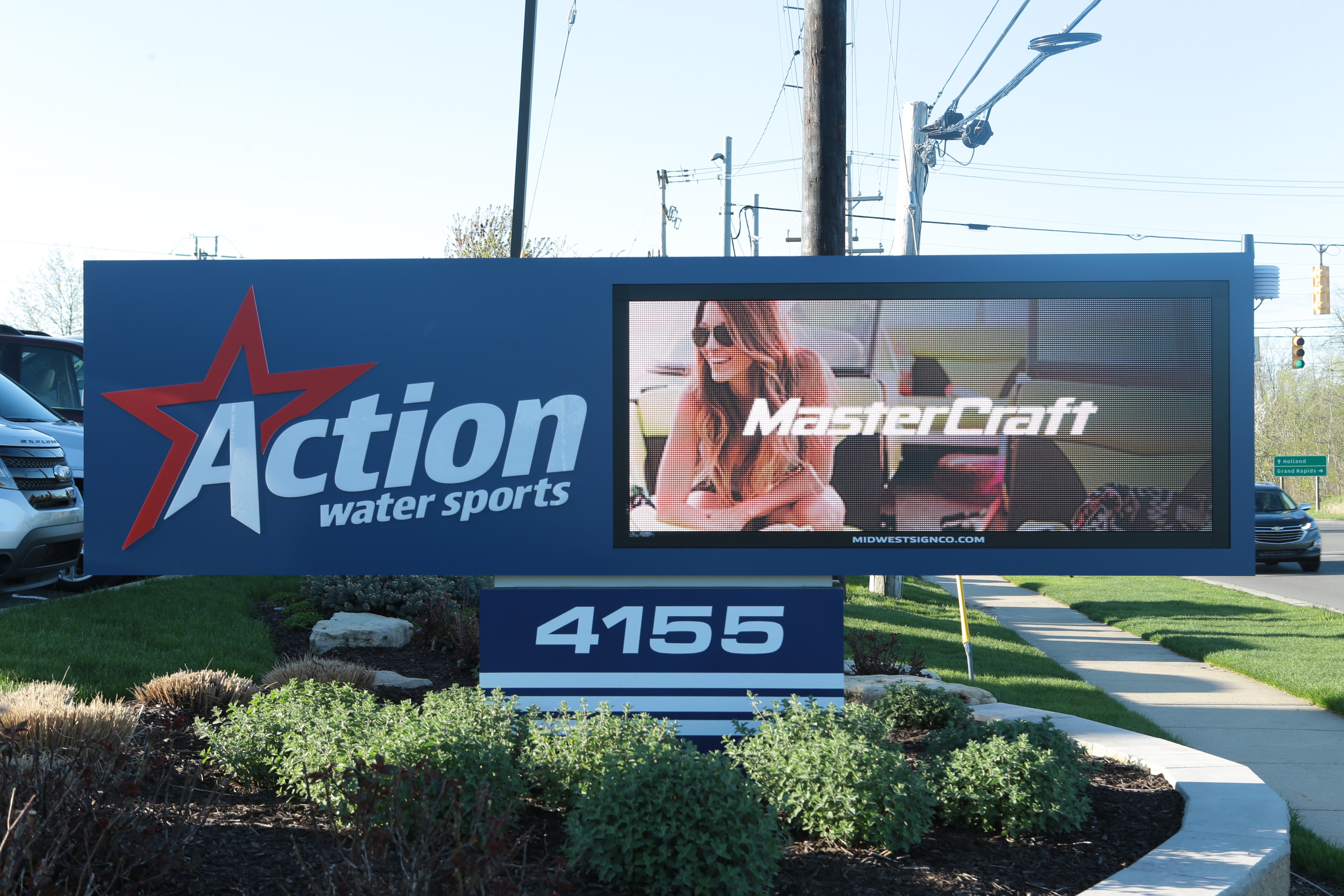 The biggest factor in maximizing your business impact is the content displayed on the LED sign. Choosing the correct text size, color, and font for your creative content will help achieve a larger impact for your business. Graphic content is more visible to the viewer and more effective in capturing the attention of your community.LEDs use red, green, and blue, but they are capable of producing a variety of colors. The colors used in the sign will also affect how long the LED sign lasts. Since other colors require less power, using less white in your LED sign content will extend how long your LED lasts. A high-color contrast factor will improve legibility.
Text Size
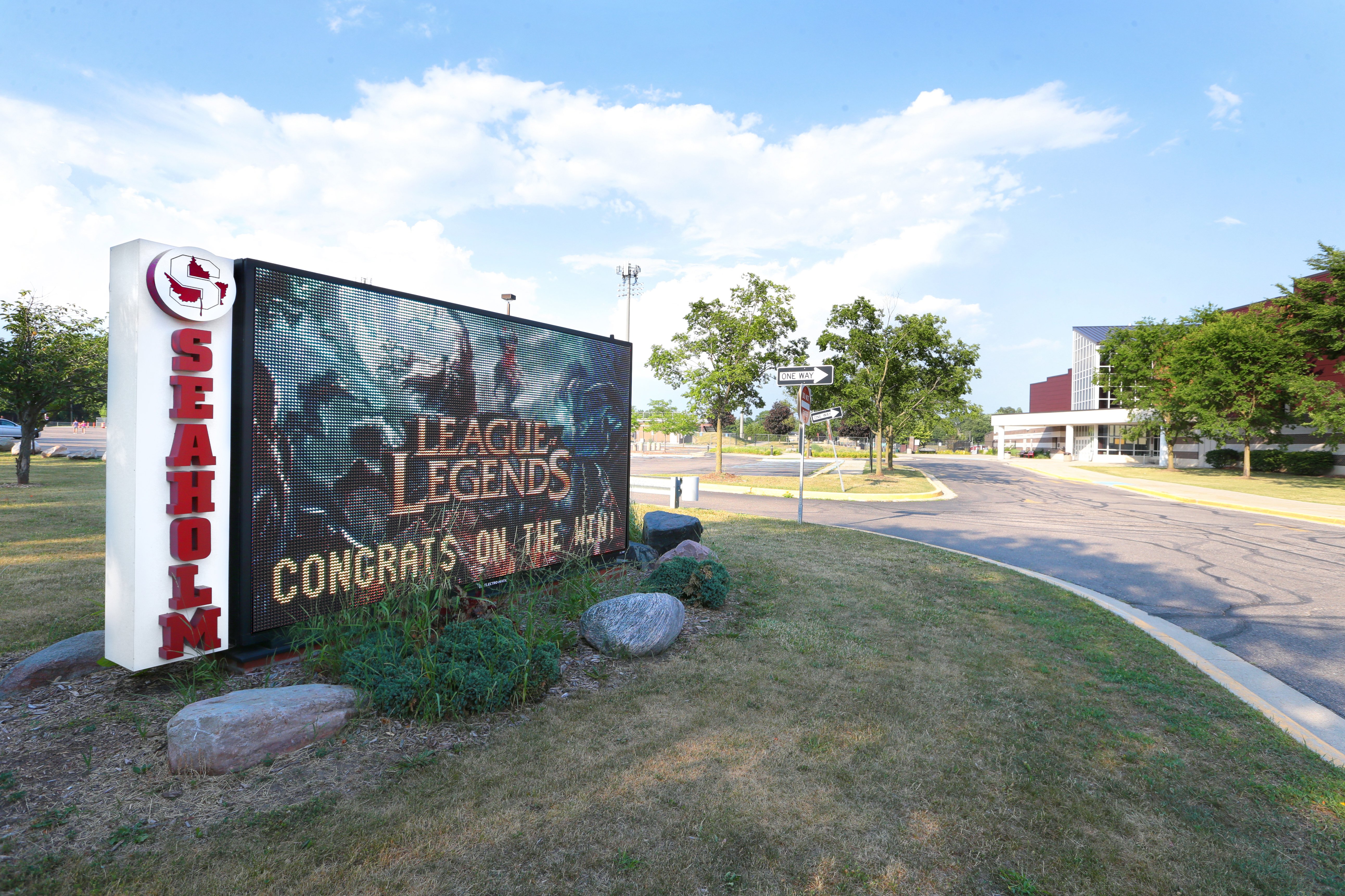 A good rule of thumb when it comes to the letter height of the text on your LED display, is that one inch of text height provides the best visibility and impact for people within approximately 10 feet of the sign. If you are hanging banners and want drivers on a nearby highway to be able to see them, design your letters at 3” or even larger.
Colors
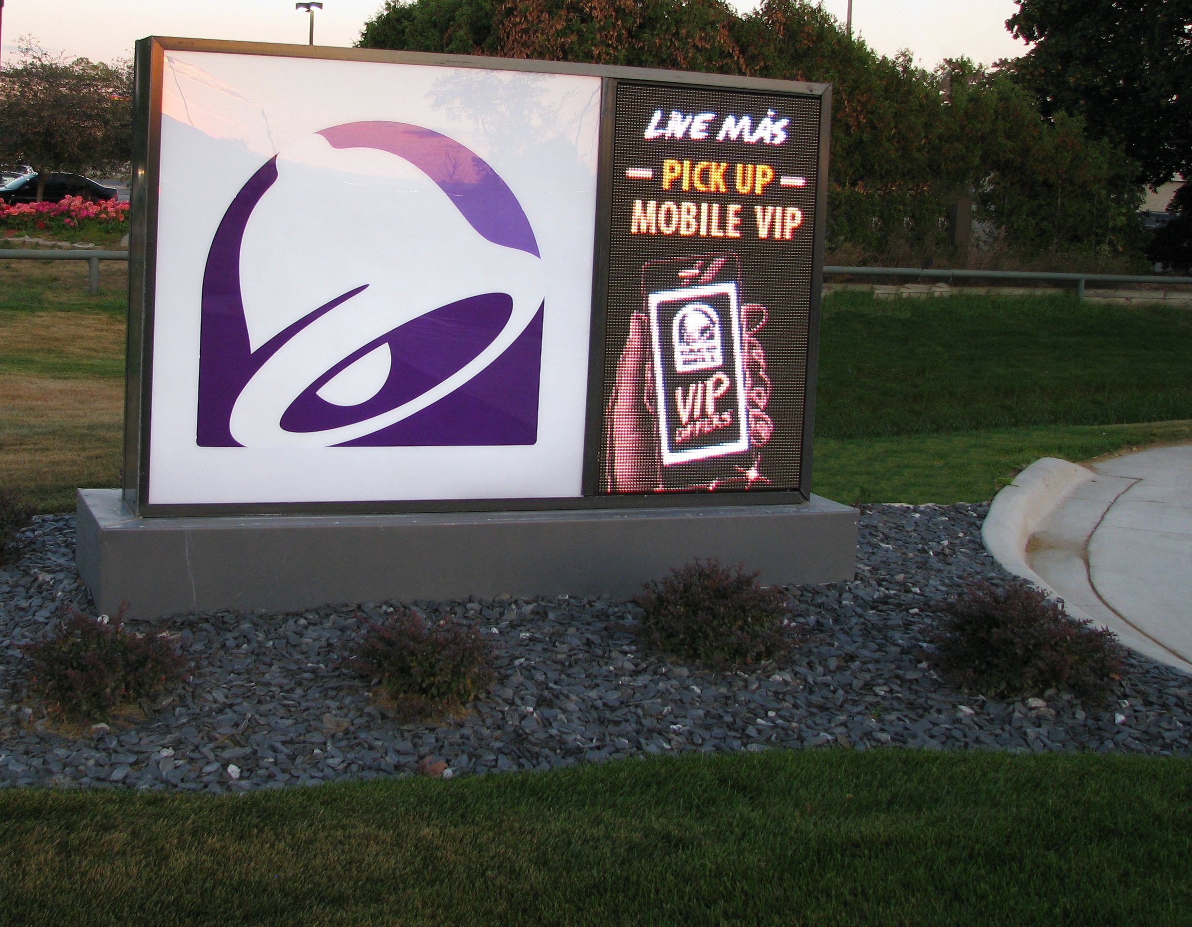 One of the most important tips when designing outdoor LED sign content is to use colors that contrast well together. Text color with a contrasting background significantly increases the impact and visibility of your sign by making your text stand out more. On the other hand, using a background color that is similar to the text color can make your message almost impossible to see at any distance. Some of the most visible text colors include black, red, and white, each of which can be seen the best with a contrasting background color. The readable distance can vary 10% depending on various color combinations.
Fonts
 The font type that you choose can also impact the visibility of your text. Very thin fonts and script fonts can potentially decrease visibility. When choosing fonts, you should select a bold style that is easy to read and sufficient spacing between letters (kerning). Test this by typing your message in a computer program using different font styles, colors, and sizes. Printing the document out and post it against a wall. Stand back and view the message at different distances to see how font choice comes into play when choosing the proper lettering for your sign.
Font choices are critical as well. Any font available on the workstation that your sign software sits on can be uploaded to your LED sign. Because of the pixel-based nature of your LED sign, certain fonts look better. Bigger block fonts show well. Capital letters are easier to read by the masses. Stay away from cursive or other fonts that are squiggly in nature. They lose their effect when shown on the displays.
Multiple Messages
Scheduling your playlist files with an end date is a great example of advanced programming skills. Scheduling allows your full-color images to become time-sensitive. Studies declare adding a pricing element to your file means that the viewer is almost twice as likely to remember your ad when compared to static signs. The end dates easily generate calls to action.
Tips for Timing your Multi-Message Display
For optimum results, it is important that the display time of your message is equal to or less than the audience's exposure time. Depending upon the speed of the highway, Adjust the message length to ensure a motorist will have time to read it twice.
Time to Travel 1,000 Feet at Various Speeds:
- at 45 mph: 15.2 seconds
- at 55 mph: 12.3 seconds
- at 65 mph: 10.5 seconds
The minimum display time for a VMS panel is 1.5 seconds, with a customary time interval of 2.0 seconds or longer per panel. It will take a motorist approximately 4 seconds to read the single panel twice at a two-second display time.
